Visualizing accelerometer data
Every major application or breakthrough starts with just a simple idea. But an idea that has developed in the mind of one needs to tested to the real world, and preferably in an easy and fast manner. During a research project on recognizing human activities using accelerometer data, the need for quick visualizations of collected data emerged. Using a simple setup this is made possible, for everybody with an Android smartphone.
We are working on a system that can be seen as a part of a pipeline process of recognizing human activities using smartphone data. The hypotheses is that by segmenting the gathered sensory data before applying classification, as is often done directly, a richer and better understanding of the data can be obtained. To try out this idea, one can work with artificial data or, as we liked to do, with real world data. In our first attempt we used free and open available datasets with labeled activity data; the dataset of Human Activity Recognition Using Smarthphones from the UCI Machine Learning Repository and the WISDM dataset. Although it is a luxury to have labeled data, any uncertainty about performed activities and conditions is still a drawback.
To overcome this problem of unknown factors, we want to gather our own data. Because we will do small runs of a few consecutive performed activities, such as sitting, walking and taking the stairs, manual annotation would suffice and there is no need for precise labeling of each measurement. The requirements are to quickly perform an activity (without an extensive environment setup) and visualise the data for human inspection. This way we are able to get a feel of the data, before formalizing the idea.
Android Apps
Although the implementation of an Android app to gather the accelerometer data is not that complicated, it is easier to choose an existing solution. This implementation simplicity is reflected in the number of apps available performing the task of recording sensory data. After a quick review of available apps in the Google Play store, our weapon of choice became Sensor Logger. Its benefits are the adjustable sensor rate, the number of (virtual) sensors (raw accelerometer, linear acceleration, orientation, rotation, etc) and the easy csv format in which data is logged. A drawback is the lack of gps recording, but due the nature of your recordings (small in- or outdoor activities), this is not a big problem for now.
Data gathering
The Sensor Logger app logs the sensor data to eight separate csv files on the SD-card of the smartphone. These files can be transmitted to a PC, e.g. by USB or bluetooth. Because our wish is fast data- gathering, DropSpace is used to mirror the SD-card directory to our computer, using the Dropbox system.
Visualising the data
 When the data is gathered on the computer, it needs to be transformed and plotted. For
this we use a combination of Ruby and Octave scripts. The first step of this
process is to strip the csv files from comments and prepare them for an easy
Octave load call. This is done by a Ruby script, which scans a
directory for Sensor Logger created files.
The next step is to plot the data and save the graphs is png format. For this the directory with the transformed csv files is passed on to a Octave script. This script will create a graph for each measurement and one file with a few graphs accumulated.
These steps can be executed by using the command line script: $ ./transform_logs_to_directory.rb logs/set- stand-walk-stand-sit An installed Ruby and Octave environment is required.
Results
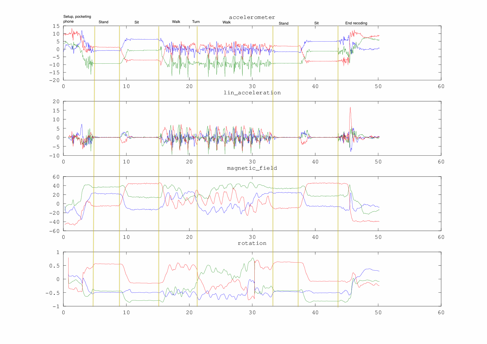
An example of a gathered plot can be seen here. Without any knowledge about the performed activities, a (slightly trained) human eye can recognize different activities, or at least transitions between them. The annotations are added manually to aid the interpretation of the data for the reader. The noisy measurements and the beginning and ending are the result of starting and stopping the logging while the phone is in the hand. The goal of this research project to automatically create the segments, i.e. the cut- points between activities.
With this setup of quick data gathering we are able to get a feeling about the data and test them in a visual manner, without the need of an (superfluous) extensive laboratory setup. This way of implementation enables fast feedback from a theoretical idea and wish for data to practical measurements which are easily interpretable for humans.
Source code
All the used source code is available on a Github project Accelerometer Plotting. Please feel free to use, reuse and modify the code to your needs. Included is one example run of activities. The graphs in logs/stand-sit- walk-stand-sit are the result of executing a single run. The activities performed are, in executed order, standing, sitting, walking with a 180 degree turn, standing and sitting. The file _accumulated_annotated.png has manually annotations to provide the reading some insight in the data.
blog comments powered by Disqus
